

Description
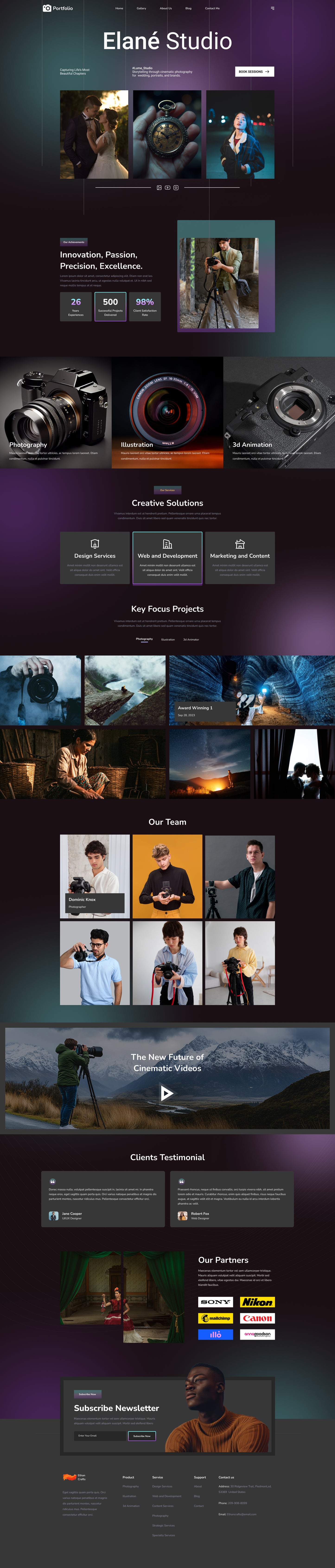
The Videographer WordPress Theme combines responsive design with flexible customization options to create an organized website structure for multimedia content. It includes multiple portfolio layouts, homepage sections, video embedding support, customizable typography, color settings, navigation menus, banner areas, footer widgets, blogs, testimonials, and contact sections. Responsive coding ensures consistent presentation across desktop computers, tablets, and smartphones. Translation readiness and compatibility with commonly used plugins provide additional flexibility while maintaining the overall layout. Clean coding practices help improve loading efficiency and website organization. Multiple page templates simplify the arrangement of galleries, project information, featured content, and written updates. Standard customization tools allow adjustments without modifying core files. The balanced design focuses on clear navigation, structured page layouts, and consistent spacing so visitors can browse multimedia content comfortably across different devices while maintaining a professional and organized appearance.
More About Premium Videographer WordPress Theme
This Videographer WordPress Theme offers a flexible framework for presenting videos, images, written content, and portfolio items through well-structured page layouts. Homepage sections can be arranged to display featured projects, testimonials, blog posts, contact information, and banner content in a logical sequence. Video embedding allows multimedia content to remain integrated with supporting text and visuals. Responsive layouts automatically adapt to different screen sizes, maintaining readability and navigation across devices. Theme customization settings include typography, colors, headers, logos, backgrounds, widgets, and navigation menus, allowing visual adjustments without affecting functionality. Clean coding practices contribute to consistent performance, while translation readiness supports multilingual websites. Multiple page templates provide flexibility when creating different types of pages, helping maintain a unified design throughout the website. The overall structure emphasizes clarity, organized navigation, and balanced spacing for an improved browsing experience.
Additional built-in features help simplify website management by providing organized content sections, footer widgets, customizable banners, and structured portfolio pages. Blog integration supports regular publishing of articles and updates while maintaining consistent formatting across the website. Compatibility with commonly used plugins extends available functionality without requiring major design changes. Standard customization options allow updates to page layouts, navigation, colors, typography, and branding elements through familiar settings. Responsive design ensures images, videos, and text remain properly aligned on desktop computers, tablets, and smartphones. The clean layout reduces unnecessary visual clutter and keeps important content easy to locate. Flexible page templates support different content arrangements while preserving design consistency throughout the website. Together, these features provide a structured and adaptable website solution focused on multimedia presentation, organized navigation, and reliable performance across modern browsing devices.
- Choosing a selection results in a full page refresh.
- Opens in a new window.